Welcome, Future Web Developers!
As students of the IT Technician, you are about to learn one of the most valuable skills in modern technology - frontend development. This comprehensive guide will take you from zero to a fully functional, deployed website using industry-standard tools and practices.
You will master HTML5, CSS3, JavaScript, DOM manipulation, responsive design, version control and much more. By the end of this tutorial you will have your own live website and a strong foundation for your future career.
14-Step Guide to Creating a Website
Step 1: Set Up Your Development Environment
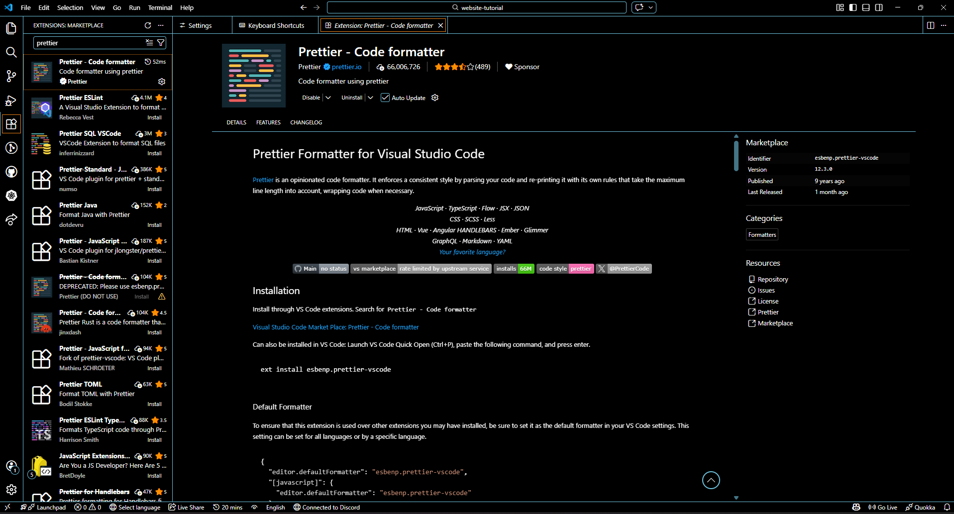
Download and install Visual Studio Code (Click to download) - the most popular IDE among professional developers. Install essential extensions: Live Server, Prettier, and Auto Rename Tag. These tools will make your frontend development workflow much faster.
Step 2: Create Project Structure
Create a new folder called my-first-website. Inside it make three files: index.html, style.css, script.js. This is the standard structure for every web project.
Step 3: Write Your First HTML5 Document
Start with the HTML5 doctype and basic structure. Use semantic HTML elements: <header>, <nav>, <main>, <section> and <footer>. Semantic markup improves SEO and accessibility.
In index.html file:
<!DOCTYPE html>
<html lang="en">
<head>
    <meta charset="UTF-8">
    <meta name="viewport" content="width=device-width, initial-scale=1.0">
    <title>My first website!</title>
</head>
<body>
    <!-- This is where the page content will be -->
</body>
</html> Step 4: Style with CSS3
Use the following CSS as a starting point for your page styling. It includes variables, global styles, layout, and example sections.
In style.css file:
/* CSS Variables for easy theme changes */
:root {
--primary-color: #3498db;
--secondary-color: #2ecc71;
--font-family: 'Arial', sans-serif;
--max-width: 1200px;
--spacing: 1.5rem;
}

/* Global styles */
* {
margin: 0;
padding: 0;
box-sizing: border-box;
}

body {
font-family: var(--font-family);
line-height: 1.6;
color: #333;
background-color: #f9f9f9;
padding: var(--spacing);
}

/* Layout */
header, nav, main, section, footer {
margin-bottom: var(--spacing);
}

/* Example header */
header {
background-color: var(--primary-color);
color: white;
padding: clamp(1rem, 2vw, 3rem); /* Responsive padding */
text-align: center;
}

/* Example navigation */
nav ul {
list-style: none;
display: flex;
gap: 1rem; /* Modern way to space items */
justify-content: center;
}

nav a {
text-decoration: none;
color: white;
font-weight: bold;
}

/* Example section */
section {
background-color: var(--secondary-color);
color: white;
padding: var(--spacing);
border-radius: 8px;
max-width: var(--max-width);
margin: 0 auto;
}
Step 5: Master Layout Techniques
Learn Flexbox for one-dimensional layouts and CSS Grid for two-dimensional layouts. These are the most important tools for creating professional, responsive designs.
How to Learn Flexbox and CSS Grid
- Official Documentation: Flexbox, CSS Grid on MDN.
- Interactive Tutorials: Flexbox Froggy, Grid Garden - learn by playing games.
- YouTube Tutorials: Search for “Flexbox tutorial” or “CSS Grid tutorial” for visual explanations.
- Practice Projects: Build nav bars, card layouts, and landing pages using Flexbox/Grid.
- Cheat Sheets: Flexbox, Grid.
- Tips: Start with Flexbox for single-row/column layouts, then use Grid for two-dimensional layouts. Experiment using browser dev tools to see changes live.
Step 6: Add Interactivity with JavaScript
Use JavaScript (ES6+) to manipulate the DOM. Add event listeners, interactive menus, form validation, and dynamic content. This is where your site comes alive.
Learning JavaScript Tips
- Event Listeners: Use
addEventListenerto respond to clicks, form submissions, hover events, etc. - DOM Manipulation: Use
document.querySelector,document.getElementById, ordocument.createElementto read or modify HTML elements dynamically. - Form Validation: Check user input before submission using JS and display feedback.
- Dynamic Content: Update your page without reloading using JS, for example loading new cards, menus, or text based on user interaction.
- Practice Projects: Toggle menus, modal popups, interactive tabs, and live search filters.
- Resources: MDN JavaScript Guide, The Modern JavaScript Tutorial
Step 7: Implement Responsive Design
Use media queries and the viewport meta tag to make your website look perfect on phones, tablets, and desktops. This is called responsive web design.
How to Learn Responsive Design
- Viewport Meta Tag: Makes layouts scale correctly on mobile.
- Media Queries: Change styles depending on screen size.
- Mobile-First: Start small, then expand for bigger screens.
- Flexible Layouts: Use Flexbox and CSS Grid.
- Responsive Units: rem, %, vw, vh and clamp().
- Testing: Use browser DevTools device mode.
Step 8: Speed Up Development with Bootstrap
Include Bootstrap 5 via CDN and use its grid system, ready-made components, and utility classes to build beautiful interfaces quickly. It is perfect for rapid prototyping and learning layout structure.
What to Learn in Bootstrap
- Grid System: Containers, rows, and columns.
- Components: Buttons, cards, navbar, modals.
- Utilities: Spacing, colors, flex helpers.
- Responsive Classes:
col-md-6,d-flex, etc. - Documentation: Bootstrap Docs
Step 9: Version Control with Git
Install Git and learn the basic commands:
git init, git add,
git commit, and git push.
Version control is essential in every IT job and allows you
to track changes, collaborate, and safely manage your code.

Basic Git Workflow
- git init - start a repository
- git add . - stage changes
- git commit -m "message" - save a version
- git push - upload code to GitHub
Learning Resources
Step 10: Host Your Code on GitHub
Create a free account on GitHub and push your repository online. This becomes the starting point of your professional developer portfolio, allowing you to showcase projects, track progress, and collaborate with others.
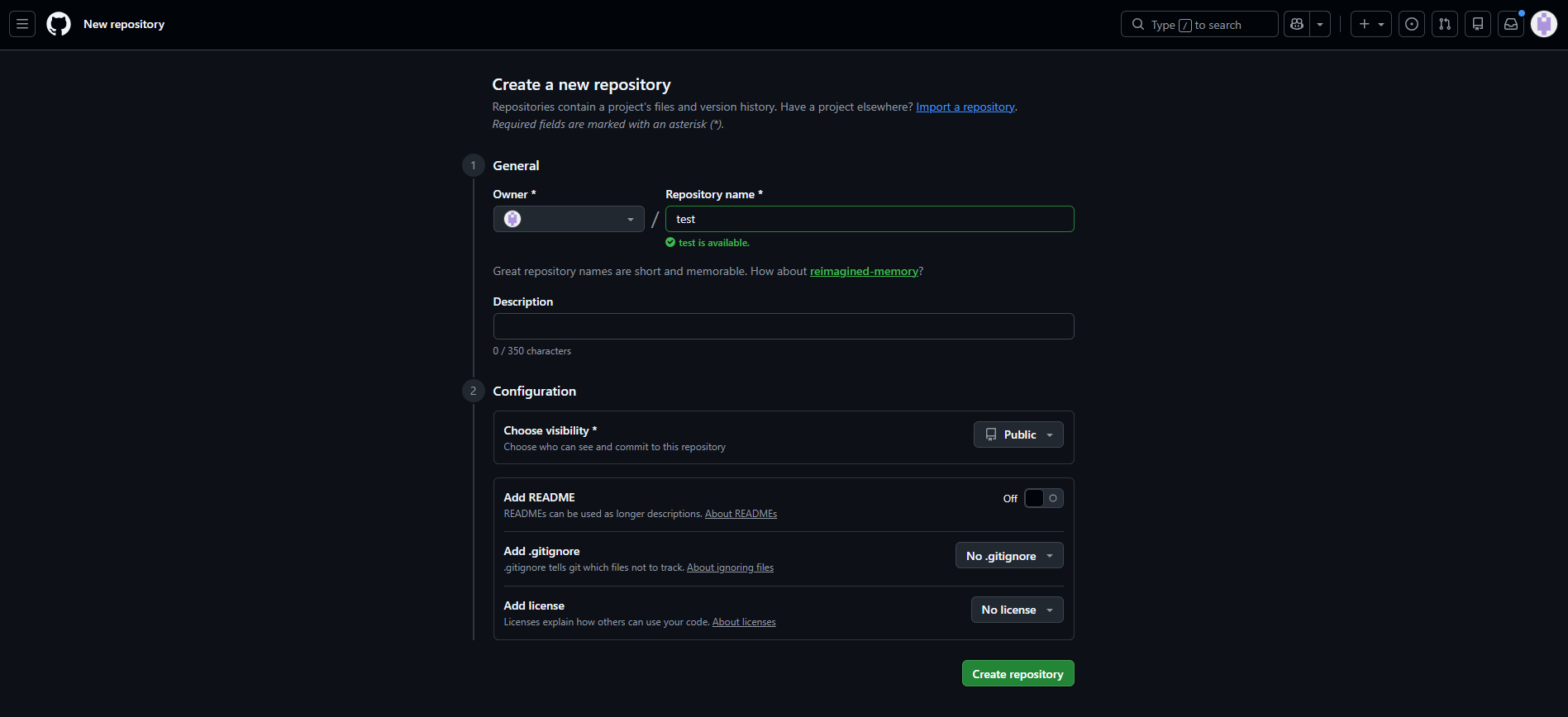
Steps to Get Started
- Create a free GitHub account.
- Create a new repository.
- Connect your local project using Git.
- Push your code using
git push. - Keep updating your repository as you learn.
Helpful Resources
Step 11: Deploy with GitHub Pages
Enable GitHub Pages in your repository settings to publish your website online.
Your project will be live at:
https://yourusername.github.io/repository-name.
This provides free hosting and automatic deployment for your website.
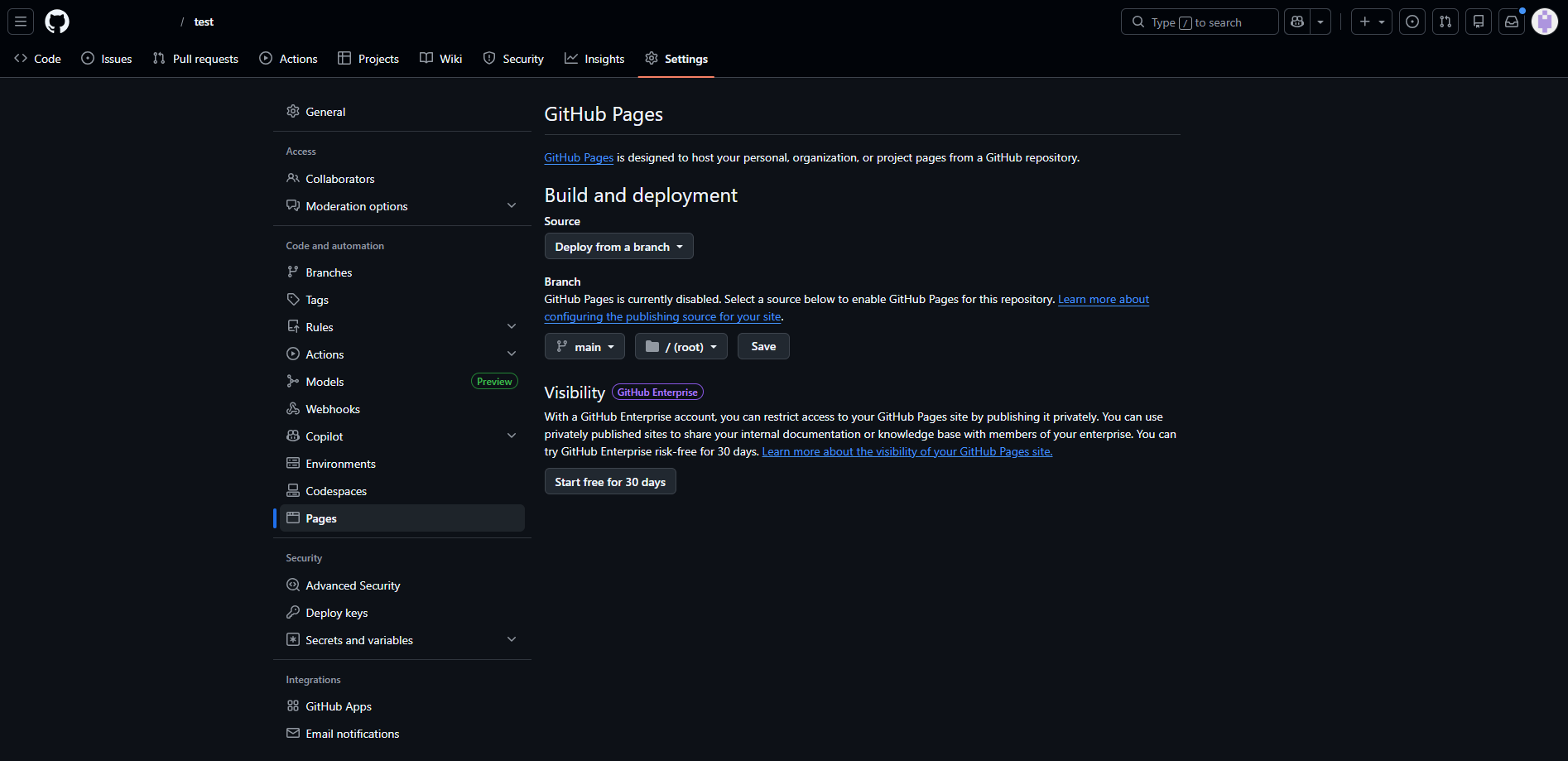
How to Deploy
- Open your repository on GitHub.
- Go to Settings.
- Select Pages from the sidebar.
- Choose the
mainbranch as the source. - Save and wait a moment for deployment.
- Your website will be available online.
Why GitHub Pages?
- Free hosting
- Easy deployment
- Perfect for portfolios
- Automatic updates after every push
Step 12: Optimize for SEO
Improve your website visibility by adding proper
meta tags, titles, descriptions, and
Open Graph tags. Use semantic headings and
alt attributes for images.
Good SEO = more visitors.
Add the following SEO tags inside your <head> in index.html:
<!-- SEO Meta Tags -->
<title>My First Website | Frontend Learning Journey</title>
<meta name="description" content="A beginner-friendly frontend development roadmap covering HTML, CSS, JavaScript and GitHub.">

<!-- Open Graph (Social Media Preview) -->
<meta property="og:title" content="My First Website">
<meta property="og:description" content="Follow my journey learning frontend step by step.">
<meta property="og:image" content="https://picsum.photos/1200/630">
<meta property="og:type" content="website">Step 13: Ensure Accessibility (a11y)
Make your website usable for everyone, including people using screen readers or keyboard navigation. Accessibility improves UX, SEO, and professionalism.
Key accessibility practices:
- Use semantic HTML elements
- Add
alttext to images - Ensure good color contrast
- Enable keyboard navigation
- Use ARIA attributes when needed
Example improvements:
<!-- Accessible navigation -->
<nav aria-label="Main navigation">
    <ul>
        <li><a href="#home">Home</a></li>
        <li><a href="#steps">Steps</a></li>
        <li><a href="#contact">Contact</a></li>
    </ul>
</nav>

<!-- Accessible image -->
<img src="website.png" alt="Example website layout preview">

<!-- Accessible button -->
<button aria-label="Open menu">☰</button>
Test your website using: WAVE or Lighthouse accessibility audits inside Chrome DevTools.
Step 14: Test, Debug & Celebrate!
Before publishing your website, test it carefully on different browsers, devices, and screen sizes. Professional developers always verify that everything works correctly everywhere.
What you should test:
- Cross-browser compatibility (Chrome, Firefox, Edge, Safari)
- Mobile, tablet, and desktop layouts
- Navigation links and buttons
- Responsive design behavior
- Performance and loading speed
Use browser DevTools to find and fix problems:
How to open DevTools:

Windows/Linux → F12 or Ctrl + Shift + I
Mac → Cmd + Option + I

Useful tabs:
• Elements  → inspect HTML & CSS
• Console   → find JavaScript errors
• Network   → check loading speed
• Lighthouse → run performance tests
Fix bugs, improve layout, and polish your project. Testing is a crucial part of real-world web development!
Recommended Resources
- MDN Web Docs – the best reference
- freeCodeCamp – free courses
- GitHub – your portfolio
- CSS-Tricks – advanced CSS
Example Website Created From This Guide
Below is a real example of a website built using the steps from this tutorial. It demonstrates HTML structure, CSS styling, responsive design, and basic JavaScript interactivity learned throughout the guide.
Live Demo Project
A fully deployed website created by students following this step-by-step tutorial.
Visit Live Website →